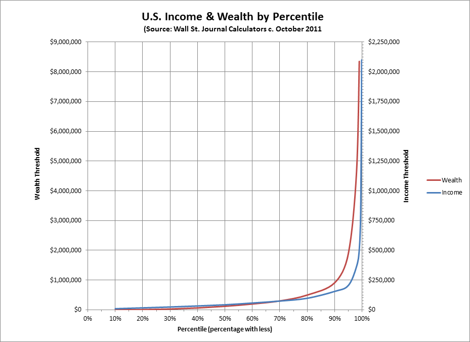
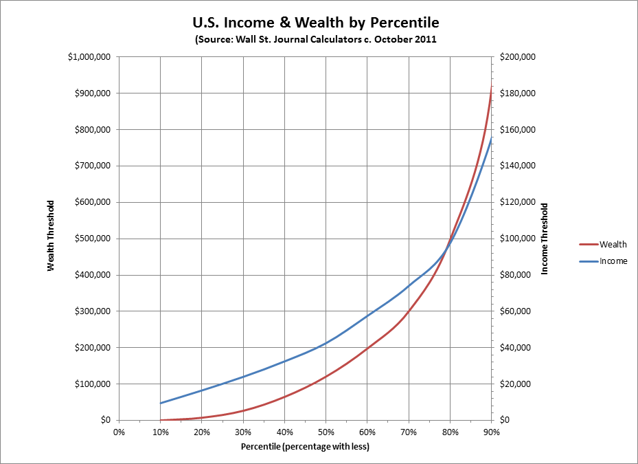
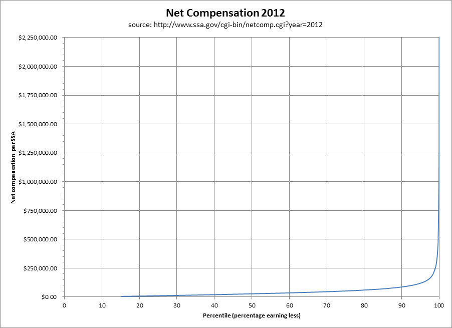
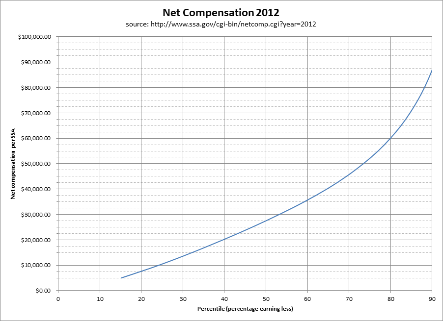
Comparison of some graphs I made a while back using a "calculator" on the Wall St. Journal's website (which I believe was based on Emmanuel Saez's study, at least for income) and graphs I just made (on 12/29/13) using 2012 compensation data from the Social Security Administrations website. The threshold levels for the various percentiles are NOTABLY lower in the SSA data, but I do not know if this is because I am somehow comparing apples and oranges. Please note that I am not an economist or other expert, but only someone concerned with the problem of inequality who knows how to fool around with Excel.
In both sets of data, income (and wealth in the WSJ set) can be seen to spike DRAMATICALLY somewhere beyond the 90th percentile. Compared to the top 1% to 2% – or even the top 5% – MOST Americans are VERY POOR.
|
|
|
|